2020 was a year unlike any other. If you’re a productivity geek, it didn’t disappoint. Whether we talk about the release of Hey from Basecamp, the delight of using Craft, the ease of Boards within Todoist or the introduction of Nozbe Teams, companies worked hard this past year.
Instead of my past Productivity Awards (see 2016, see 2017) at the end of a calendar year, I’d like to suggest seven things that I would love to see happen in 2021. Each request comes from an app that I have used or currently use.
Seven things I’d like to see in 2021:
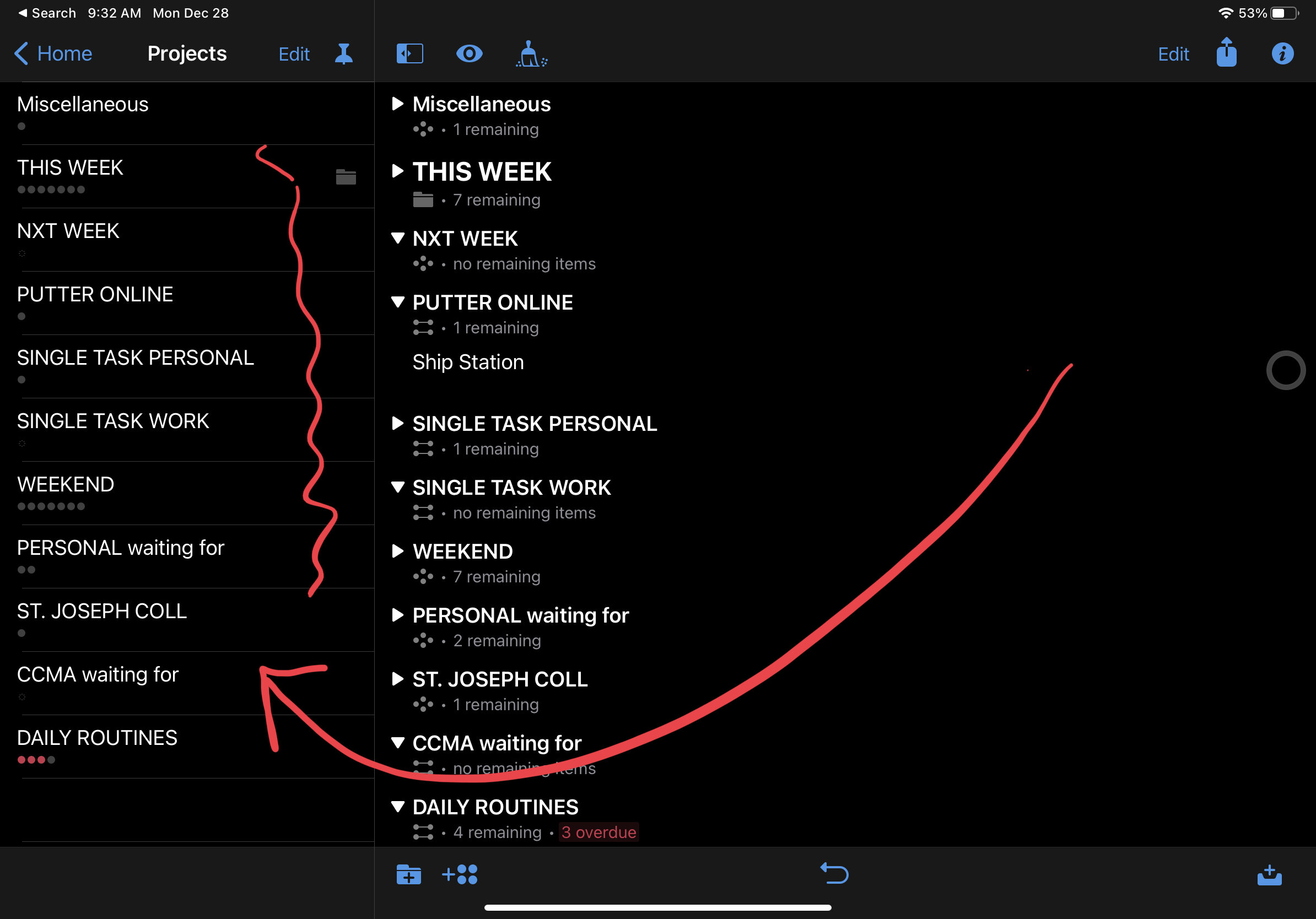
1. OmniFocus for iOS UI improvements. It’s time for better font treatments on OmniFocus for iOS. Am I the only one who can’t stand the Arial font treatment on OF 3 for iOS? While we’re at it, how about removing those annoying dots under each project that indicate how many todos you have? Finally let’s make the persistent gear icon “hideable” in the top corner of the Home Screen.
2. The use of multi-panels by Todoist on iPad OS. I absolutely adore Todoist and feel that their update schedule is second to none. This one is a bit nit-picky but what the heck: how about a better use of the real estate on iPad OS? There’s just too much screen to not have a better multi-paned viewing of the app. You can see from the image below, the entry takes up way too much real estate for my taste.
3. More control over the left panel within Nozbe Teams. We want to edit, archive and delete tags in Nozbe Teams. While it’s nice to be able to expand/hide the tags, let’s take it to the next level and put some muscle into the left sidebar.
4. For TickTick to stop copying the features of Todoist. This tweet from the CEO of Todoist is pretty convincing. I’ve had concerns about the lack of TickTick’s transparency for the past year. Nice app with lots of functionality but please, stop the copying.
5. Font size increase for Things3 on iOS. We know, Things3 is an opinionated app with beautiful UI but phone sizes are larger than ever. Can we please increase the size of a) the fonts and b) the buttons that you need to push to complete and item?
6. A simpler UI for Notion. Notion is very powerful but still feels like an engineer and a chemist concocted the thing. I can’t think of an average, everyday person who could actually figure the app out. Please, make it simpler so that non-geeks can use Notion and benefit from its endless list of features.
7. A smoother, more reliable UI for Basecamp on iOS. Again, I love Basecamp but find that the iOS app lags behind the desktop and web version. As an example, why does the “attachment” bar take so long to show up when you need it most within a todo item?
And while we’re at it, how about completely versions of the following:
Nozbe Personal: Since the company’s been putting a lot of energy towards Nozbe Teams, Personal has suffered. The UI is, ahem...tired. While hundreds of thousands of folks use Personal each month, it’s hard to imagine moving forward without a major redesign.
Basecamp 4: it’s not that there’s anything wrong with BC3 but a guy can dream. All Basecamp needs to do is provide some new polish and users will be pleased. For bonus points, a deeper discount for nonprofit users would be a happy surprise.
OmniFocus 4: this is highly unlikely since OF3 is just a few years old. Nonetheless, it sometimes feels as if the OmniGroup moves so slow since it has so many products. If OF is their flagship, why not put a faster touch on its updates and releases? OF 4 could benefit from a unified experience between iOS and the Mac.
Things 4: we are going on year four since Things 3 came out but it feels exactly the same as it did in 2017. I’d love to see saved filtering and a much larger font.
I write all of this with a smile. We have it made when it comes to great apps from truly special companies. Let’s hope for a smoother year in 2021 and the thoughtful productivity that goes along with it.


